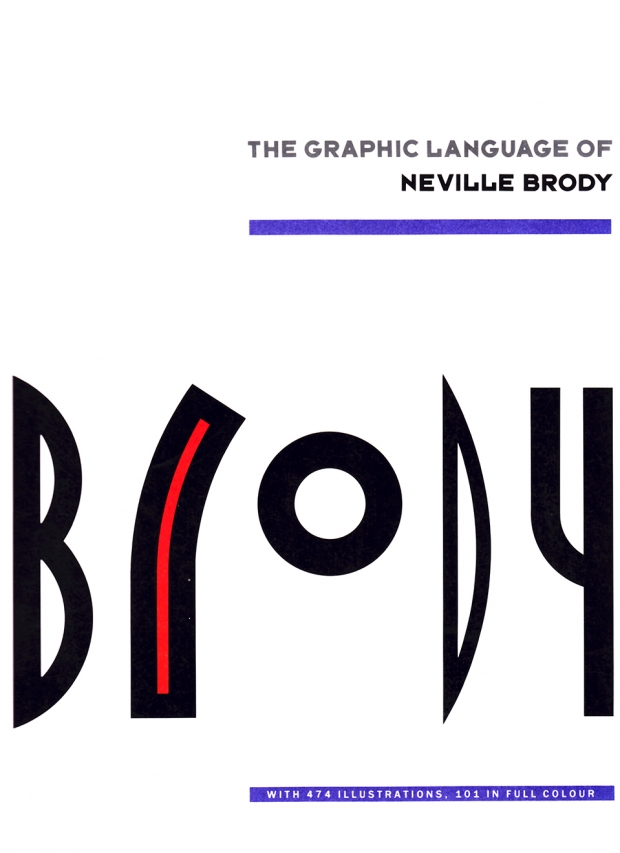
The Graphic Language of Neville Brody
by Jo Wozencroft
Thames and Hudson, 160 pages, 1988
Two names always come to mind when I think of ’80s graphic design. One is Peter Saville, the prolific designer for Factory Records and architect of the timeless New Order, Joy Division, et al. album cover looks. The other is Neville Brody, who through his work at The Face in particular, had a demonstrable and much-copied effect on other designers of the day, and whose influence is still evident in today’s media.
This first volume of The Graphic Language of Neville Brody (a second edition was published in 1994), serves as both a fascinating meditation on design and its process, but also as a companion catalogue to the 1988 exhibition of the same name at London’s Victoria and Albert Museum.
While the exhibition would have surely been wonderful to attend, the book allows Brody to explore his motivations, thoughts and growth from late-1970s punk who once designed a stamp at the London College of Printing depicting the Queen’s head sideways (his strict instructors in the notoriously difficult graphic program were not amused) to a sophisticated design icon.
Divided into six main sections — Typography, Music, Books, Magazines, Posters, and Language — the book follows Brody’s thinking through specific projects and more generally. His insights and self-reflection make this truly required reading for the design-inclined. He acknowledges his dislike and ignorance of the power of typography in his early years, later explaining how he came to understand the form and in fact set himself a challenge on every assignment.
His experiments with typography and these personal challenges are most evident in his work for The Face, where he sought to have every headline, every typeface of every story work in harmony with not only the images, but to convey tone, even emotion. Brody’s experiences and views on typography are to me, the highlight of a book with many highlights to choose from. His work with Cabaret Voltaire, for example, is wonderful to revisit as a fan of the band and collector of vinyl, but also to gain new insight and appreciation for the thought and work that went into each cover, every advertisement.
It’s those details and Brody’s overarching philosophy and his musings on design (both good and bad) will undoubtedly keep me returning to this book over and over again. The only thing more I could ask would be that I had the sense to pick up a copy sooner.


